
Circle App
Case Study
Project Overview
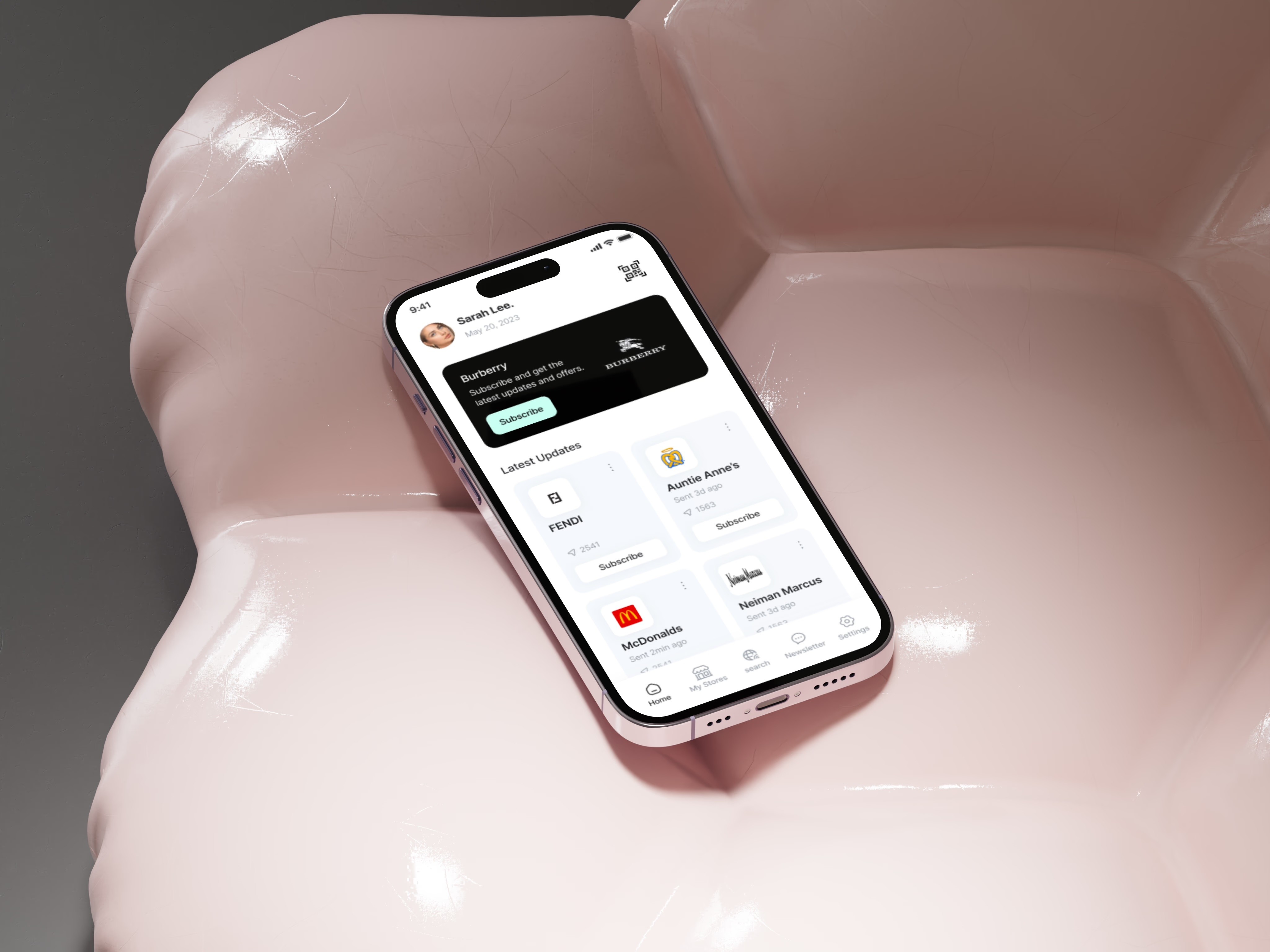
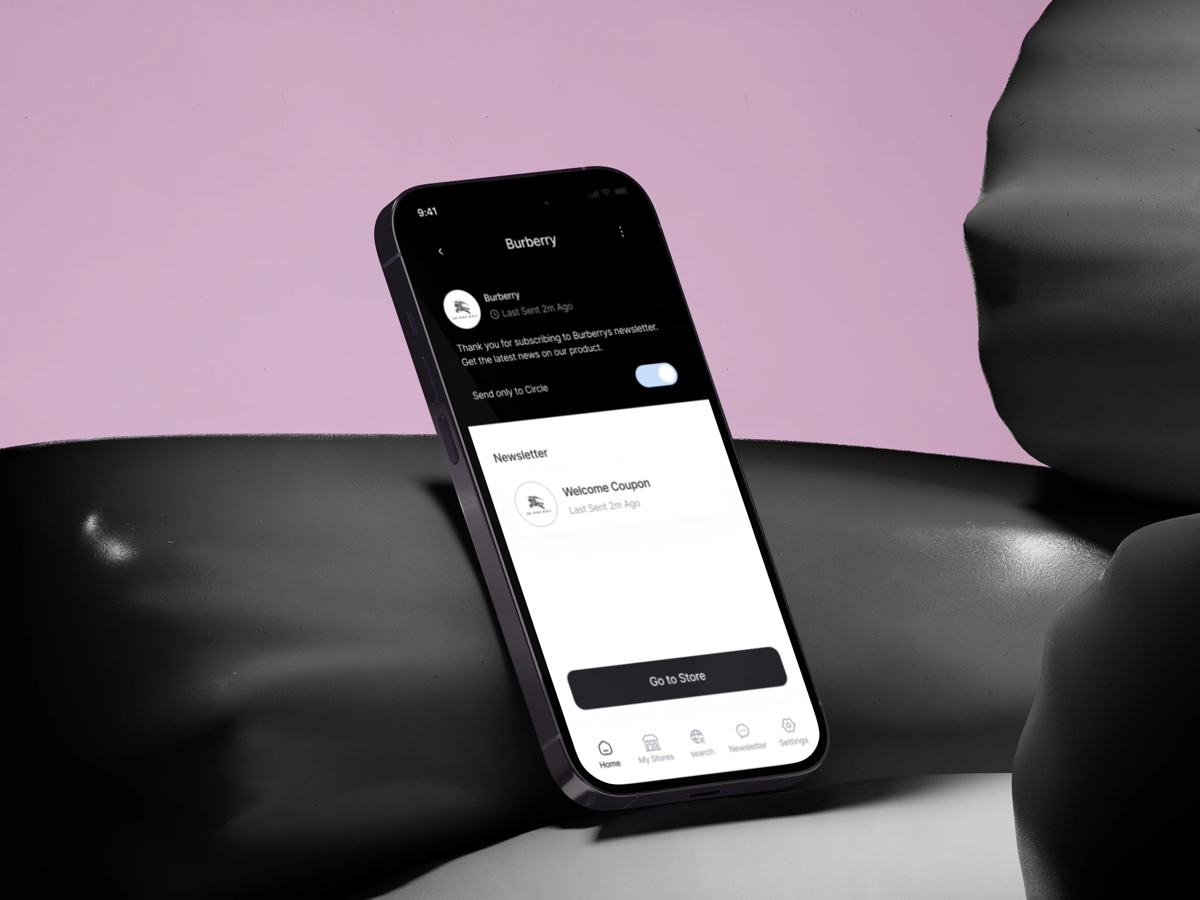
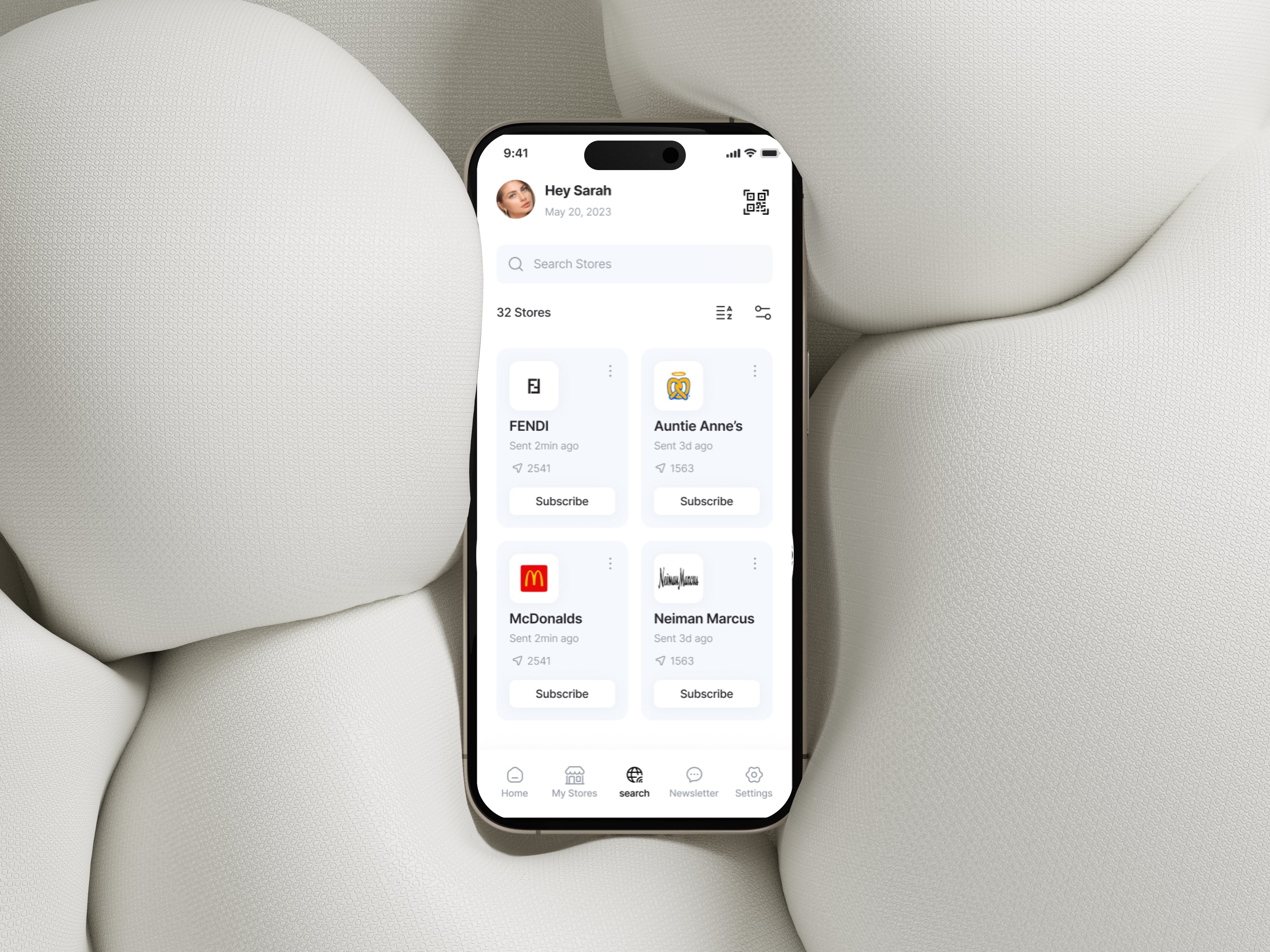
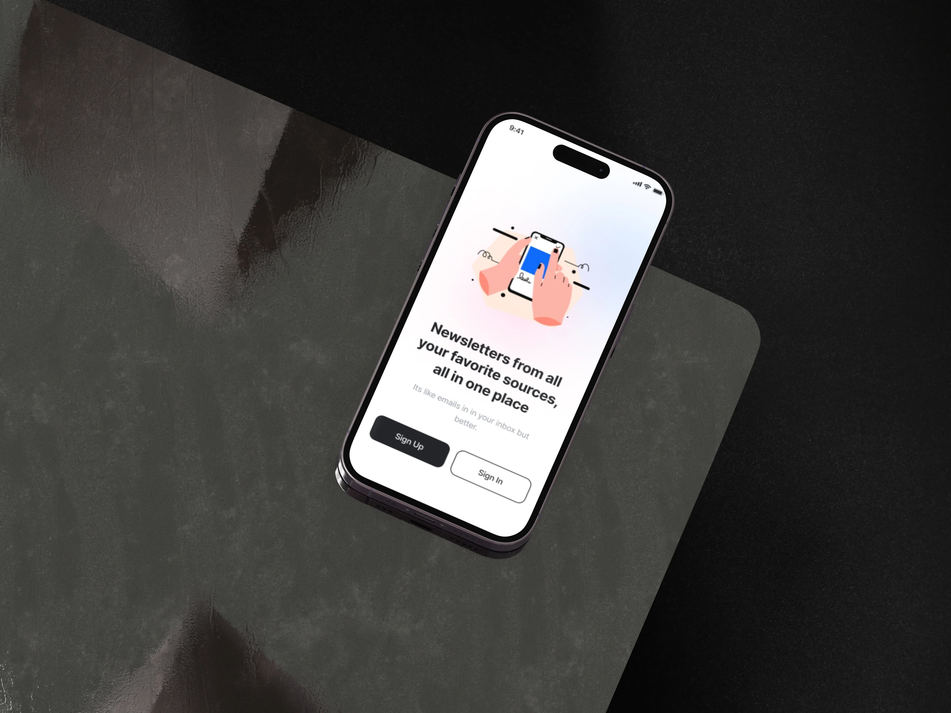
The Circle App simplifies membership management by providing users with a centralized platform to store membership barcodes digitally for quick access at checkout. It also serves as a communication hub, delivering store newsletters, updates, and personalized notifications to keep users informed about tailored promotions and events. The goal was to create a seamless user experience while ensuring the app maintains Circle’s brand consistency across devices.
Problem Statement
Users managing multiple memberships often face challenges accessing digital membership barcodes and communications from various stores. The Circle App needed to offer a simple and efficient solution for storing digital membership barcodes and centralizing store communications, while providing a personalized experience that enhances the user's shopping journey.
Objectives
Develop an intuitive app that stores digital membership barcodes for easy checkout access.
Centralize store communications, delivering newsletters and updates within the app.
Implement personalized notifications to inform users of promotions and events tailored to their preferences.
Ensure brand consistency through scalable design elements that reflect Circle’s values.
Optimize accessibility and inclusivity for all users.
Research Phase
Competitive Research
In developing The Circle App, we conducted competitive research, reviewing several apps that focus on digital membership management, store communications, and personalized user experiences:
Apple Wallet
Strengths: Apple Wallet allows users to store and access digital cards, tickets, and passes in a secure and intuitive interface. It provides a clean layout with seamless integration.
Weaknesses: While highly functional, the app offers limited personalization features for promotions or tailored communications.
Stocard
Strengths: Stocard excels in offering users a way to store multiple digital membership cards in one place with a simple, accessible interface. Its barcode scanning feature is highly valued for its ease of use.
Weaknesses: The app focuses more on card storage and less on delivering personalized experiences or store communications.
Shopkick
Strengths: Shopkick provides users with personalized offers and rewards for shopping, creating a highly engaging user experience. The app’s layout encourages interaction with promotions and in-store experiences.
Weaknesses: The user interface can sometimes feel cluttered with offers, making navigation less intuitive for those looking for a streamlined experience.
Design Approach
Branding and Identity
We created a brand identity that embodies Circle’s core values of simplicity, efficiency, and personalization. The logo is memorable and scalable, and the color palette and typography were selected to reflect modernity and trust. These elements were applied consistently across the app to ensure brand uniformity.
Key Design Elements:
Scalable, minimalistic logo reflecting simplicity and ease of use.
Harmonized color palette to establish trust and clarity.
Typography focused on readability and user engagement.
User Experience (UX) Design
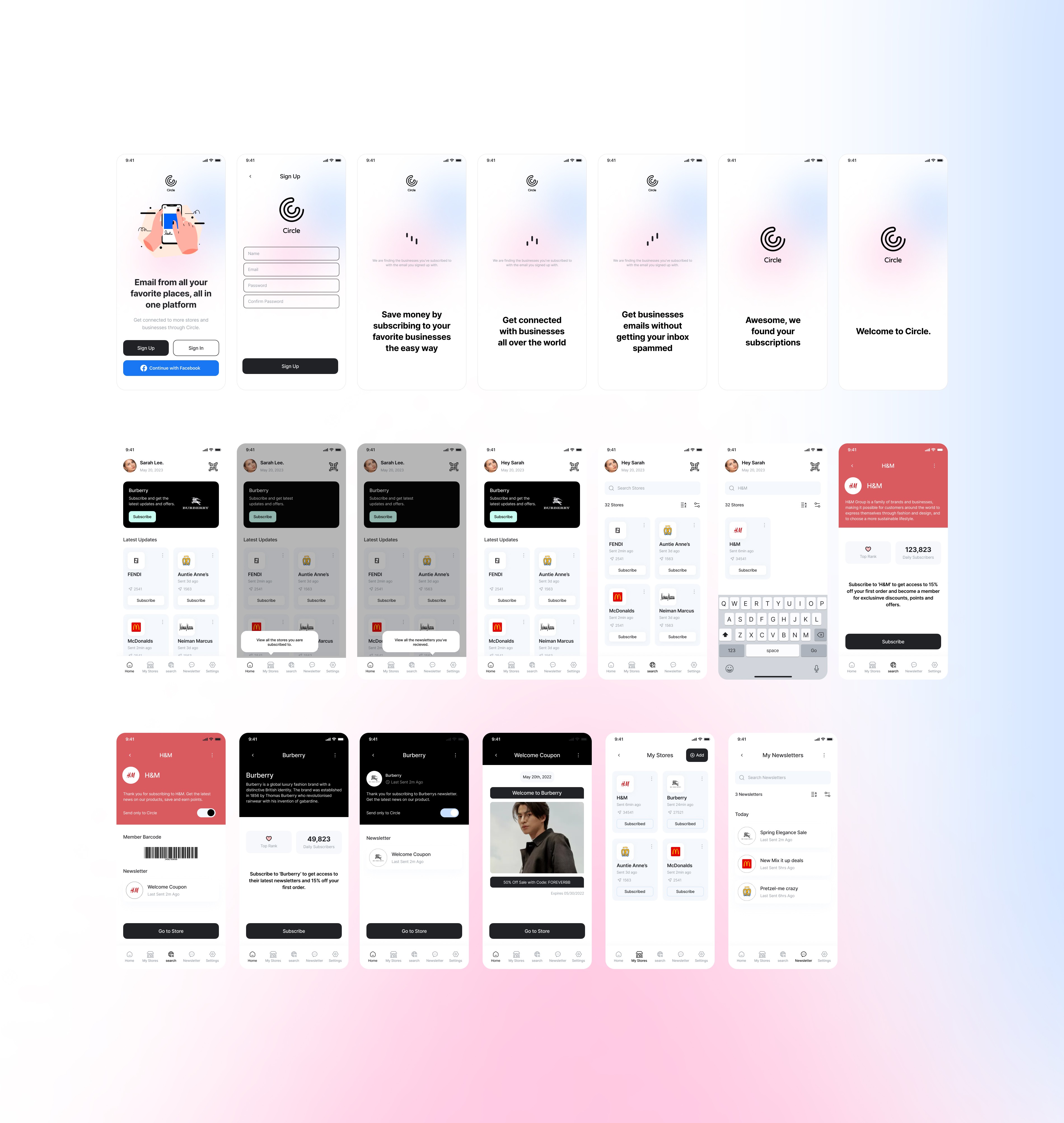
To enhance user experience, we created wireframes and high-fidelity prototypes that guided the app’s development. The design prioritized simplicity, ensuring users could easily store and retrieve digital membership barcodes, view store communications, and receive personalized notifications.
Primary Focus:
Seamless, intuitive navigation for storing and accessing digital membership barcodes.
Clean, organized display of newsletters and updates within the app.
Personalized notifications based on user preferences, enhancing engagement with promotions and events.
Design System Implementation
We implemented a comprehensive design system that ensures consistency across the app’s UI components. The design system included a UI component library, pattern guidelines, and scalability protocols, ensuring that Circle’s brand integrity is maintained as the app evolves.
Key Elements:
Consistent design language across all screens and components.
Scalable UI components that allow for seamless future updates.
Mobile-first approach, ensuring optimal performance across devices.
Accessibility and Inclusivity
In line with Circle’s commitment to inclusivity, we ensured the app was accessible to all users, including those with disabilities. The app incorporated contrast-rich color schemes for visually impaired users, screen reader compatibility, and intuitive navigation to support users with cognitive and motor impairments.
Accessibility Features:
High-contrast colors for visually impaired users.
Screen reader compatibility for blind users.
Intuitive navigation for users with cognitive disabilities.
Voice commands and keyboard navigation support for users with motor impairments.
Conclusion
Through competitive research, user-centered design, and comprehensive testing, The Circle App successfully simplifies digital membership management and centralizes store communications while maintaining brand consistency. The app delivers a personalized, accessible experience that enhances user engagement with tailored promotions and events, offering a streamlined and intuitive interface for users across all devices.
