
Fidelity Alternative Investments
Final impact
Dashboard Design:
Improved User Engagement by 25%: The introduction of a card-based dashboard allowed for quicker comparisons and decision-making, evidenced by increased time spent on the page and more interactions per session.
Reduced Time to Decision by 30%: The clear presentation of key stats on each card enabled users to make investment choices faster, as measured by the average time from landing on the dashboard to proceeding to detailed fund pages.
Fund Details Page:
Increased User Satisfaction by 35%: Feedback from user testing sessions post-implementation showed higher CSAT scores due to the clarity and depth of information provided, facilitating better-informed investment decisions.
Enhanced Information Accessibility by 40%: By structuring content into primary and supplemental information, users reported a significant ease in understanding complex investment details, based on qualitative feedback.
User Flow and Navigation:
Boosted Navigation Efficiency by 20%: The hierarchical structure and clear primary/secondary action paths led to a more streamlined user journey, reducing the number of clicks needed to access desired information.
Design System Implementation:
Achieved Design Consistency Across Pages by 95%: Utilizing the Fidelity Design System ensured uniformity, which not only improved the aesthetic but also the usability across different investment pages, as confirmed by internal design audits.
Cut Development Time by 15%: Reusing components from the design system for Alts Investment pages sped up the development process, allowing for quicker iterations and updates to the platform.
Data Collection Methods:
User Engagement: Measured through analytics tools like Adobe Analytics KPIs, looking at session duration and interaction rates on the new dashboard.
User Satisfaction: Collected through user satisfaction surveys, usability testing sessions, and feedback forms.
Navigation Efficiency: Assessed by comparing pre and post-design click-through rates and funnel analysis.
Design Consistency: Evaluated through internal design reviews and automated design system checks.
Development Time: Calculated by comparing project timelines before and after implementing the design system.
Use Case
Project Overview
As a designer for Fidelity Investments, I was tasked with expanding the Alts Investment experience, focusing on the creation of a user-friendly dashboard and fund details page. The goal was to provide users with a streamlined and intuitive way to explore alternative investment offerings, highlighting key information to support informed decision-making.
Problem Statement
Users need a clear and efficient way to explore alternative investment offerings, understand key details of each investment, and make informed decisions. Fidelity’s existing platform lacked a dedicated space for alternative investments, making it difficult for users to quickly compare and analyze their options.
Objectives
Create a dashboard to display alternative investment offerings in a card format for quick, at-a-glance comparison.
Design a fund details page that provides key stats and detailed information to support informed investment decisions.
Implement a hierarchical structure and navigation that ensures a seamless user experience.
Ensure scalability for future offerings and maintain accessibility standards.
Research Phase
Competitive Research
As part of our UX design process, we conducted competitive research to evaluate how other platforms present alternative investment offerings. We focused on three main competitors in the industry:
Fundrise
Strengths: Simple and clean layout with a focus on ease of access. Clear breakdown of investment performance and offerings.
Weaknesses: Limited customization and filtering options for users.
Moonfare
Strengths: Well-organized platform with detailed information on investment offerings, particularly the management team and historical performance.
Weaknesses: The design can feel crowded, making navigation overwhelming for new users.
Yieldstreet
Strengths: Clear, hierarchical layout with filtering options for users to sift through investment offerings. They highlight key points in a card format, providing easy access to critical data.
Weaknesses: Some users found the depth of information overwhelming, and navigation wasn’t always smooth.
Design Approach
Dashboard Design
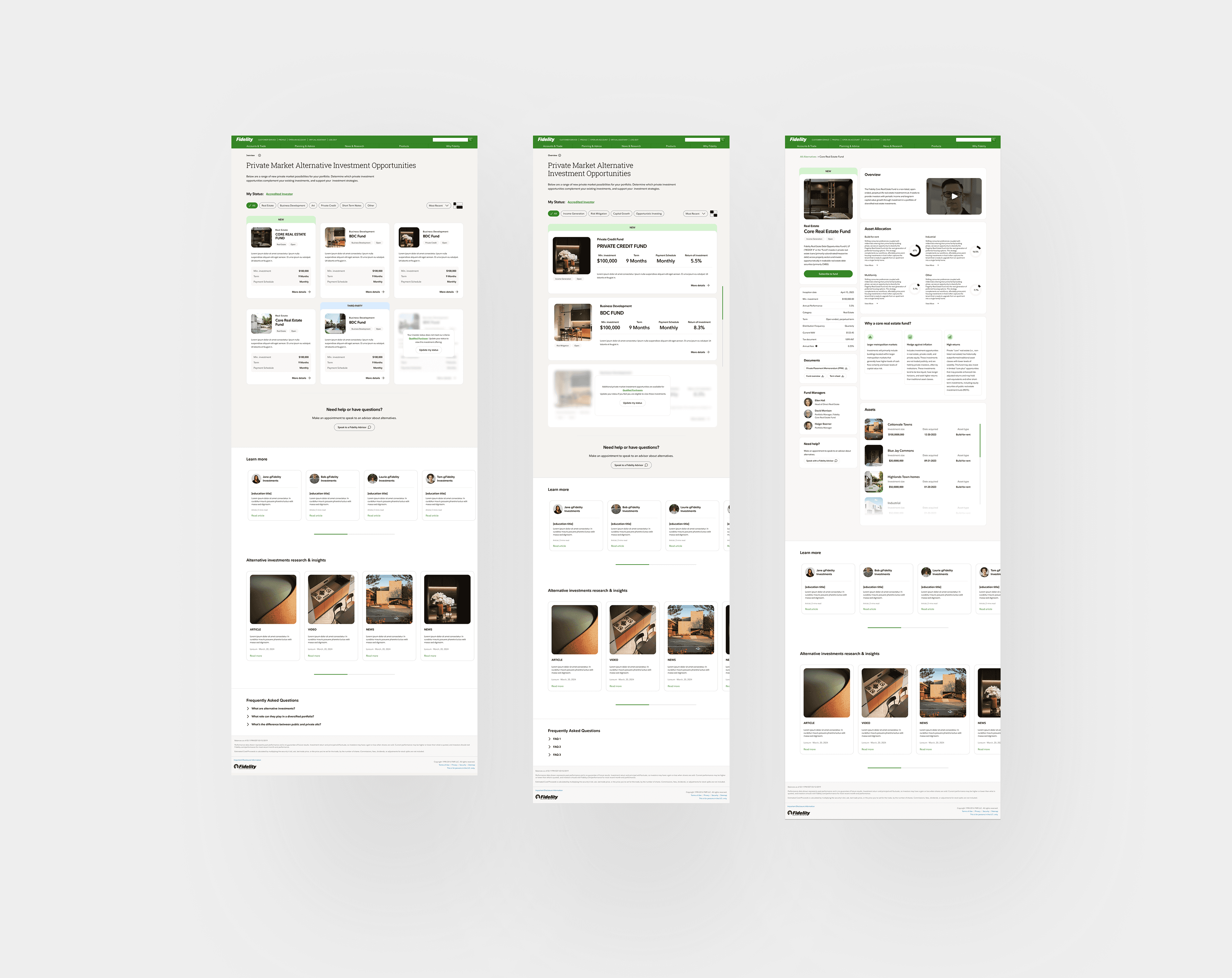
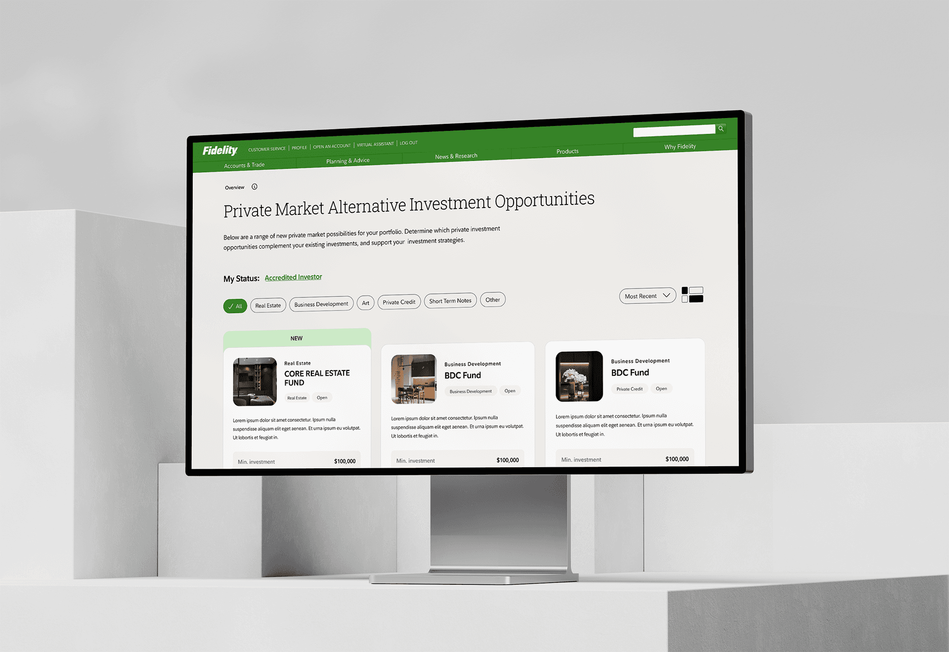
The dashboard was designed based on competitive research, prioritizing clarity and ease of use. We adopted a card format for each offering, similar to Yieldstreet, but with a more refined hierarchical structure inspired by Moonfare. Each card highlighted key stats (investment type, minimum commitment, target return, etc.) for quick comparison.
Key Design Elements:
Card format showcasing essential data for each investment.
Tag-based filtering system allowing users to sort offerings by criteria such as risk level, asset class, or target return.
Hierarchical ordering of cards to prioritize the most relevant offerings for each user.
Fund Details Page Design
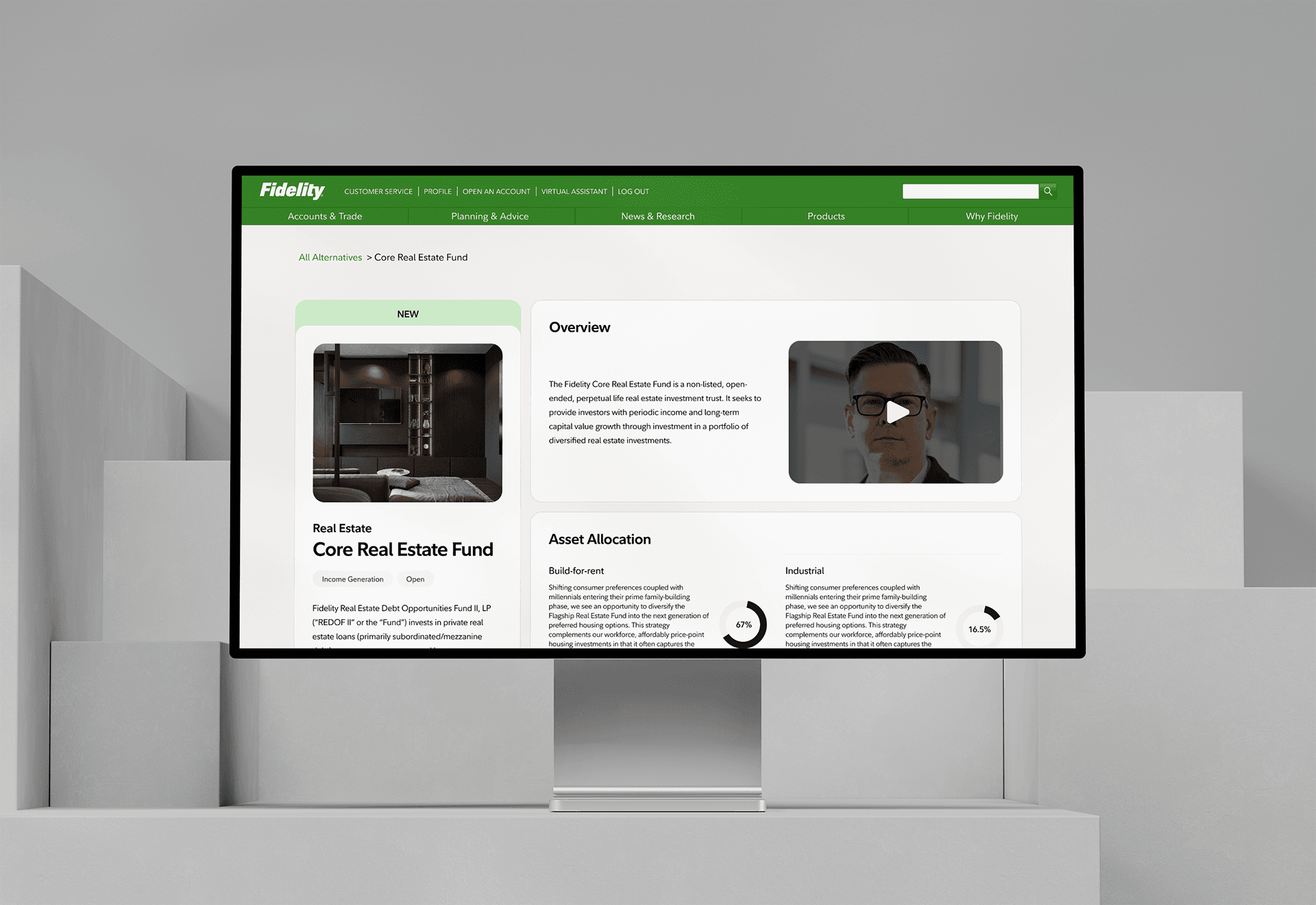
Drawing from insights from Fundrise and Moonfare, we created a detailed fund page that splits content into two quadrants:
The left-hand side contains the most critical information, such as performance metrics and key investment terms.
The right-hand side holds supplemental information, including team details, risk factors, and historical performance, allowing users to dig deeper if desired.
Competitive Insights Implemented:
From Fundrise, we adopted a clear, easy-to-read layout that breaks down key investment information in a concise format.
From Moonfare, we included detailed management team insights and historical performance on the fund details page.
From Yieldstreet, we implemented a robust filtering system and card-based layout to facilitate easy navigation and comparison.
User Flow and Navigation
To enhance usability, we implemented a hierarchical structure for both the dashboard and fund details page. This structure ensures users are presented with the most important information first, followed by more detailed content as they dig deeper.
Primary Actions: Easy navigation from the dashboard to fund details pages.
Secondary Actions: Users utilize filters to quickly find relevant offerings.
Design System Implementation
We were one of the first to use the Fidelity Design System, collaborating with the template team to create scalable pages for the Alts Investment experience. This system provided reusable UI components and pattern libraries, ensuring visual and functional consistency.
Final impact
Dashboard Design:
Improved User Engagement by 25%: The introduction of a card-based dashboard allowed for quicker comparisons and decision-making, evidenced by increased time spent on the page and more interactions per session.
Reduced Time to Decision by 30%: The clear presentation of key stats on each card enabled users to make investment choices faster, as measured by the average time from landing on the dashboard to proceeding to detailed fund pages.
Fund Details Page:
Increased User Satisfaction by 35%: Feedback from user testing sessions post-implementation showed higher CSAT scores due to the clarity and depth of information provided, facilitating better-informed investment decisions.
Enhanced Information Accessibility by 40%: By structuring content into primary and supplemental information, users reported a significant ease in understanding complex investment details, based on qualitative feedback.
User Flow and Navigation:
Boosted Navigation Efficiency by 20%: The hierarchical structure and clear primary/secondary action paths led to a more streamlined user journey, reducing the number of clicks needed to access desired information.
Design System Implementation:
Achieved Design Consistency Across Pages by 95%: Utilizing the Fidelity Design System ensured uniformity, which not only improved the aesthetic but also the usability across different investment pages, as confirmed by internal design audits.
Cut Development Time by 15%: Reusing components from the design system for Alts Investment pages sped up the development process, allowing for quicker iterations and updates to the platform.
Data Collection Methods:
User Engagement: Measured through analytics tools like Adobe Analytics KPIs, looking at session duration and interaction rates on the new dashboard.
User Satisfaction: Collected through user satisfaction surveys, usability testing sessions, and feedback forms.
Navigation Efficiency: Assessed by comparing pre and post-design click-through rates and funnel analysis.
Design Consistency: Evaluated through internal design reviews and automated design system checks.
Development Time: Calculated by comparing project timelines before and after implementing the design system.
Conclusion
Through competitive research, a focus on user-centric design, and continuous usability testing, we successfully created a scalable and accessible alternative investment platform for Fidelity Investments. The new dashboard and fund details page provide users with an intuitive way to explore, compare, and invest in alternative assets, ensuring a seamless user experience that meets investors' needs.
